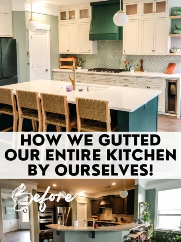
I am so excited to be working on a DIY makeover of our kitchen over the first couple of months. I have previously shared my mood board for this space but I still have a few decisions to make!
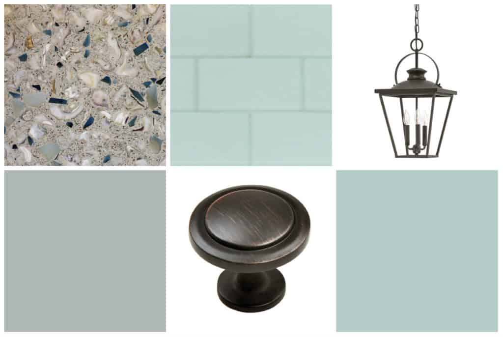
While I know what finishes in general I want, I have been trying to decide about some of the details. For example, I had a huge debate over the counter tops and cabinets. Should they all be the same? Should the island pop? Here were my (rough photoshop) ideas:
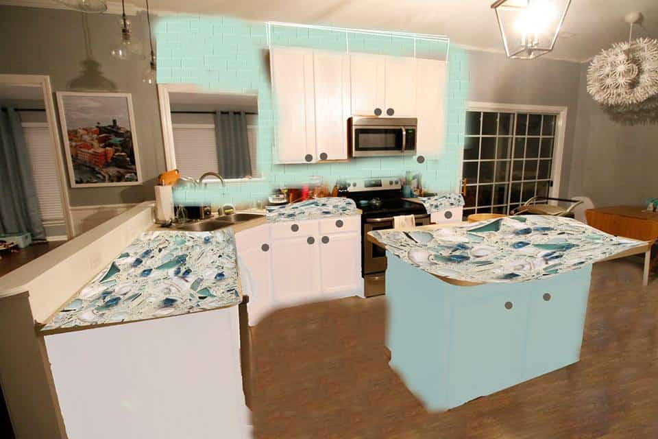
This is the first option, including recycled glass counter tops throughout (the glass chunks will be waaaaay smaller I just stretched my photo of a sample to fit this pic). The island is painted watery and the rest of the cabinets are white. Is it too much?
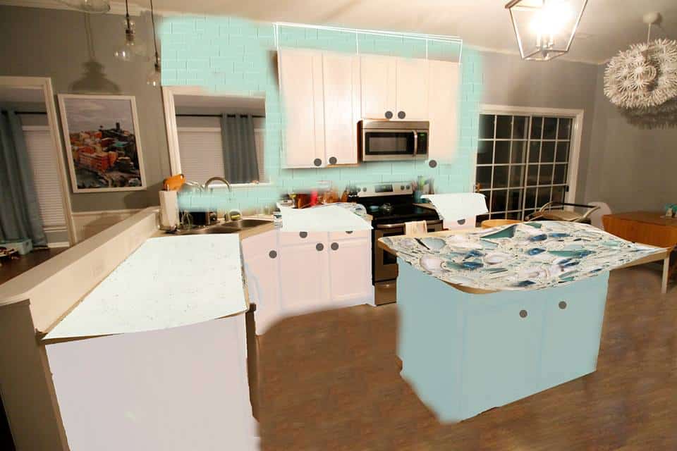
this option tones down the look with all white quartz on the main cabinets and only the recycled glass on the island, which is still Watery. It really makes the island pop! But is the white too boring for me? Does the cabinets and countertops being different make the space feel too disjointed?
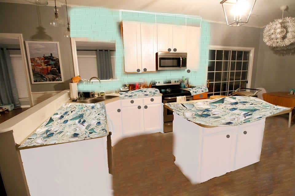
This option includes all white cabinets and all recycled glass counter tops. It offers the most consistency - but is it too boring? Are the counter tops too much?
The other debated though less time sensitive decision is about the back splash. I love the idea of tiling to the ceiling but Sean wants to just keep it under the cabinets. I see what he means - the peek through window makes it kind of weird on the left side, and we plan on having a lower but not an upper on the far right (probably tiny open shelves instead).
What do you think?!
 |
|||
 |
 |
 |
 |

Hello, I'm Morgan, half of the creative force behind CharlestonCrafted.com! With a passion for DIY that dates back to 2012, I've transformed three homes and now I'm dedicated to helping others craft their dream spaces. Let's turn your house into a home together!



Harper says
I like the third option best (all white cabinets with the recycled glass countertops). It makes the countertops and backsplash stand out more. I find the painted island distracting and overpowering, especially with the backsplash. And I vote tile the whole wall. What a statement!
Katie says
Is the recycled glass countertop textured? If it's not totally smooth, I would do it as an accent so that the bulk of your workspace is easier to wipe clean. I like the second option the best.
Morgan says
It is actually completely smooth and hard like a stone countertop. Thanks for weighing in and thanks for stopping by!
Katie says
Oh nice! Then I amend my choice to option three. I love the colors you picked!
Danielle M Rateau says
I like the idea of making the island different....both in paint and countertop.....
also tile all the way up to the ceiling....with the open space in between the cabinet and the opening where would you stop? anywhere you stop, it will look off.....
Morgan says
Thanks so much for your feedback! I also like the idea of making the island the "jewel" of the kitchen 🙂
That is my problem with tiling! It's weird breaks and I don't know where to stop vertically or horizontally.
Thanks too for stopping by!
Jenna says
I like the first and third options the best, but I think I prefer either a grey or more saturated, navy-ish blue for the island--it looks like the counters have both of those colors in part. Basically, I like a consistent countertop (or if you want a change, I'm not a huge fan of plain white quartz) and the island popping, but I think a more neutral color would be better if you guys are only planning on being there a few years.
Morgan says
Thanks for sharing! I always actually used to pin navy kitchens and that is 100% my vibe. However, we got navy side tables and they show SO MUCH dust, dog hair, etc. So I am scared of dark colors! I will put it back in the running tough 🙂
Angie ~ ambient wares says
How fun! My fave is the third option but, I can tell no matter which way you go, you'll make it all work 🙂 Thank you for sharing with us at Funtastic Friday!