Looking for the best blue paint colors? Here is a round up of some of the best light, medium, and dark toned blue colors to use in your home!
Blue is a universally loved color.
It can be calming and serene while still bringing a touch of color into your space.
Blues come in warm tones and cool tones and range from light to dark.
Blue is also super versatile - it can pair well with neutral colors like black or crisp white, but also pairs well with bold colors.
Blue paint can work well for your front door, living room, dining room, bedroom, bathroom, or really any room in your home!
A super pale blue can work as a neutral while a darker blue can be bold and powerful.
There are tons of options for choosing a blue paint color, which can make it kind of overwhelming to pick one.
So, today I am rounding up some of the most popular blue paint colors. There is bound to be a color on this list that will look great in your home!
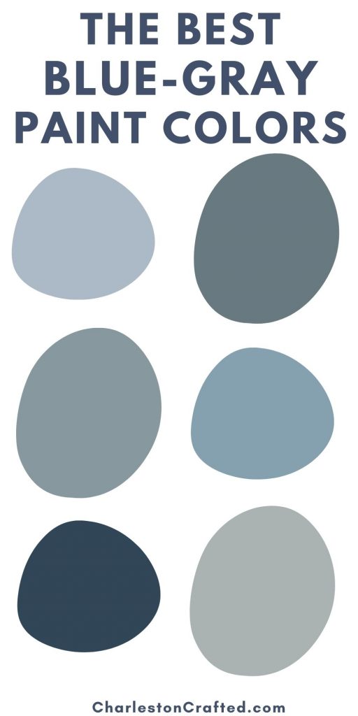
Looking for a neutral blue color? Here are my favorite blue-gray paint colors!
The best blue paint colors
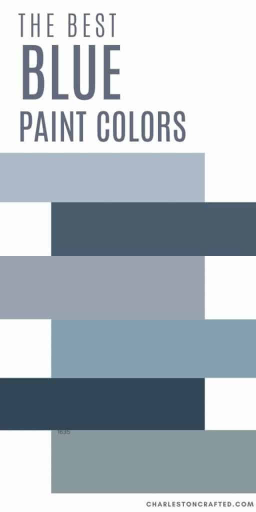
Light blue paint colors
See all of my favorite light blue paint colors here!
Palladian Blue by Benjamin Moore HC-144

Palladian Blue is a lovely, soft sky blue color. Benjamin Moore describes it as having hints of Mother of Pearl.
I see a lot of green undertones in this light blue. It's a very watery color and is especially spa-like.
While this is by no means a "bright" color, it has a lot more color pigment than some neutral or gray toned light blues.
If you like the color Sea Salt, this is basically a slightly darker and more pigmented version of that.
Click here to get a 12"x12" peel and stick sample of Palladian Blue.
Honest Blue by Sherwin Williams SW6520

Honest Blue is a light, bright blue - almost a sky blue color. It has slight gray undertones so it's not baby blue but instead a more muted shade.
I love the idea of using this shade of blue for a kitchen island paired with crisp white as an accent color.
This light blue has a really nice beachy, springtime feel to it! If you are looking for a light bright blue, this might be the shade for you.
Click here to get a 12"x12" peel and stick sample of Honest Blue.
Sheer Bliss by Benjamin Moore CSP-545

Sheer Bliss is a bright sky blue color. It has icy gray undertones and is lighter than Honest Blue.
This is definitely a cool toned blue paint color with no green undertones.
It is very relaxing and spa-like and would be great in a bedroom or bathroom.
Click here to get a 12"x12" peel and stick sample of Sheer Bliss.
Silver Mist by Benjamin Moore 1619

Silver Mist is a light blue-gray color. It is very gray and misty - hence the name.
This shade is very neutral and makes an excellent whole house or open great room paint color.
I love it because it has enough blue to it to not be boring, but still is very neutral and not scary or overwhelming to use!
Click here to get a 12"x12" peel and stick sample of Silver Mist.
Iceberg by Benjamin Moore 2122-50

Iceberg is a very light blue color with both gray and slightly green undertones.
It is very soothing and calming and can work in big, brightly lit rooms as well as smaller, darker ones.
If you are looking for a very light blue green paint, this might be the color for you.
Click here to get a 12"x12" peel and stick sample of Iceberg.
Windy Sky by Benjamin Moore

Windy Sky is a light blue paint color with a lot of gray undertones. Despite those gray undertones, it still reads as bright and very blue.
This is a great shade of blue if you have a traditionally decorated home. It pairs well with crisp white linens and trim and dark stained wooden furniture.
Click here to get a 12"x12" peel and stick sample of Windy Sky.
Brittany Blue by Benjamin Moore

Brittany Blue is another light blue-gray color, but with a little bit more gray undertones to it. It is very soft and relaxing and can feel spa-like, especially in the owner's suite of a home.
This is a really nice timeless neutral light blue paint color that can work in a lot of different spaces!
Click here to get a 12"x12" peel and stick sample of Brittany Blue.
Whispering Spring by Benjamin Moore

Whispering Spring is a light blue color with gray and slightly green undertones. It is very light, bright, and almost neutral.
This is another shade of blue that can work in almost any room or any home!
Click here to get a 12"x12" peel and stick sample of Whispering Spring.
Blue Veil by Benjamin Moore 875

Blue Veil is a light blue color with very significant gray undertones. It is definitely a blue-gray. It is extremely soft and delicate.
This is a great, timeless color option for any space that you want just a touch of blue in.
Click here to get a 12"x12" peel and stick sample of Blue Veil.
Summer Shower by Benjamin Moore 2135-60

Summer Shores is another great light blue paint option. It is brighter and more blue than a lot of these other options. It has slightly green undertones for a little bit of a light turquoise look.
This is a great option for a smaller space like a powder room or even a half wall above wainscoting! It pairs really well with crisp white.
Click here to get a 12"x12" peel and stick sample of Summer Shower.
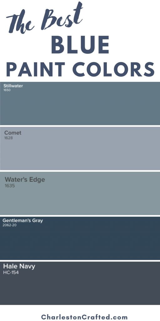
Medium blue paint colors
St. John Blue by Benjamin Moore CSP-675

St. John Blue is a gorgeous teal color. This is a really bold shade with a lot of pigment to it.
This color definitely has green undertones to it, giving it that teal tone.
However, it also has a bit of a gray dustiness, making sure that it does not feel too bright or overwhelming.
This is a great shade to pick if you want a bold, teal room or piece of furniture!
Click here to get a 12"x12" peel and stick sample of St. John Blue
Mill Springs Blue by Benjamin Moore HC-137

Mill Springs Blue is another great blue-green paint color. This shade has a lot more green to it. It is a sea-like color that is positively dreamy.
This is a really bold color choice that is not for the faint of heart, but if you love bright color, it might be perfect for your home!
Click here to get a 12"x12" peel and stick sample of Mill Springs Blue.
Cable Knit Sweater by Benjamin Moore CSP-650

Cable Knit Sweater is a really nice medium toned true blue color.
It's biggest undertone is gray, which just makes it slightly muted and not at all too bright.
It has a slight amount of green to it, giving it a slightly teal look that you might not notice unless you pair it with another blue.
This shade looks really great in traditional style homes, paired with crisp whites and black or very dark wood furniture.
Click here to get a 12"x12" peel and stick sample of Cable Knit Sweater.
Windy Blue by Sherwin Williams SW6240

Windy Blue is a nice mid-toned blue-gray color. It is a bit darker than sky blue, with a lot of gray undertones.
It's what many designers would call a "dusty blue" and it works really well in spaces that you want to feel like a beach home or like a spa. It's very soothing!
Click here to get a 12"x12" peel and stick sample of Windy Blue.
Water's Edge by Benjamin Moore 1635
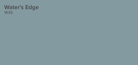
Water's Edge is a very gray blue color. There are significant gray undertones - it's honestly hard to say if this is more blue or more gray!
That level of muted-ness makes this a great color to go big with without overwhelming a space. Paint a whole room or paint all of your kitchen cabinets this gorgeous color!
Click here to get a 12"x12" peel and stick sample of Water's Edge.
Flower Box by Benjamin Moore CSP-530
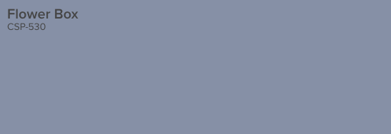
Flower Box is a blue paint color that has a lot of purple to it! It can really read as an almost lilac color, which is lovely if that is the look you are going for.
It also has a lot of muted gray undertones, so it is not too bright or overwhelming in a space.
This soft, purpley blue shade is perfect for a feminine space!
Click here to get a 12"x12" peel and stick sample of Flower Box.
Indigo Batik by Sherwin Williams SW7602

Indigo Batik is a beautiful denim blue paint color. It has a lot of gray undertones giving it the look of your favorite faded blue jeans.
This is an extremely lush color with tons of pigment to it.
It was originally part of the West Elm collection and therefore pairs really well with Mid Century Modern looking spaces.
Click here to get a 12"x12" peel and stick sample of Indigo Batik.
Luxe Blue by Sherwin Williams SW6537

Luxe Blue is a much blue-r shade of blue, without the strong gray undertones of some similar toned shades.
This color can look really blue if you were to use it for an entire room. I'd mix it up with a little white wainscoting or save this shade for a piece of furniture.
This would also make a fantastic front door paint color!
While it is bold, it still is a really beautiful shade of blue, and if you want a bold, bright blue, this could be the color for you!
Click here to get a 12"x12" peel and stick sample of Luxe Blue.
Rhine River by Benjamin Moore

Rhine River is a gorgeous aqua paint color. It is especially serene and spa-like.
Being an aqua color, Rhine River has a lot of green undertones. It also is muted with gray undertones, so it doesn't feel too bright or bold.
I really, really love this paint color. It can work well for many styles of home including traditional, coastal, or farmhouse!
Click here to get a 12"x12" peel and stick sample of Rhine River.
Riverway by Sherwin Williams SW 6222

Riverway is a deeper teal paint color. It also has a lot of green undertones, giving it that blue-green sea-like feeling.
This is a bold paint choice that looks especially stunning when you add molding under it for a tone-on-tone textured look.
Click here to get a 12"x12" peel and stick sample of Riverway.
Dark blue paint colors
New York State of Mind by Benjamin Moore

New York State of Mind is a very bright and bold teal blue paint color. It has a lot of green undertones, giving it that teal vibe.
This color is bright and might be kind of intimidating, but it looks super good in a modern style home. It pairs really well with bold blacks and gold hardware.
If you don't want to paint an entire room this bold color, it can be awesome for a bathroom vanity or kitchen cabinets!
Click here to get a 12"x12" peel and stick sample of New York State of Mind.
Naval by Sherwin Williams SW 6244
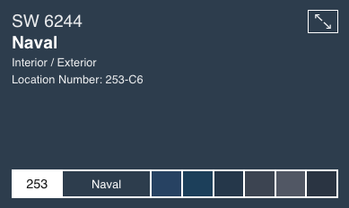
Naval is a very traditional navy blue paint color. It has a lot of gray undertones giving it that muted effect.
This is a great, moody blue if you want a room to feel dark and cozy. It's bold, but almost a neutral because of all the gray in it!
Click here to get a 12"x12" peel and stick sample of Naval.
Waterloo by Sherwin Williams SW9141

Waterloo is another great teal color. It has a lot of green in it, but also a lot of gray undertones.
This is a really great, modern blue paint color. It pairs nicely with light and mid-toned wood colors, black, white, and gray.
Click here to get a 12"x12" peel and stick sample of Waterloo.
Van Deusen Blue by Benjamin Moore

Van Deusen Blue is a true-r blue, without the green undertones that some of these other shades have.
However, it does have gray undertones, which keeps it from being too bright or bold.
This color looks great in traditional or even historical homes.
Click here to get a 12"x12" peel and stick sample of Van Deusen Blue.
Hague Blue by Farrow and Ball
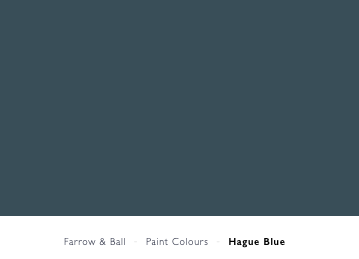
Hague Blue is a favorite navy blue paint color of many interior designers. It is really moody and cozy feeling.
There are green and gray undertones in this color, similar to many of my favorite other navy blues.
This is a really dark blue color and can almost transform depending on what you pair it with. It is so popular for a reason!
Click here to get a 12"x12" peel and stick sample of Hague Blue.
Gentleman's Gray by Benjamin Moore 2062-20

Gentleman's Gray is very comparable to Hague Blue. It is ever so slightly lighter and blue-r.
This is another great modern option that pairs really well with white, black, light gray, gold, and brass accents.
Click here to get a 12"x12" peel and stick sample of Gentleman's Gray.
Stained Glass by Benjamin Moore
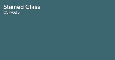
Click here to get a 12"x12" peel and stick sample of Stained Glass.
Distance by Sherwin Williams
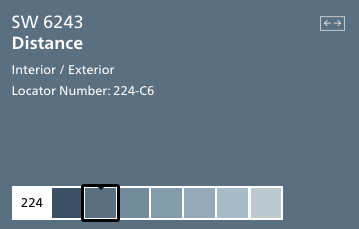
Distance is more of a true blue than a teal blue. It is not the darkest but second darkest shade on it's strip.
This blue has a lot of gray and an almost purple undertone to it.
It is really beautiful on home's exteriors, doors, and shutters.
Click here to get a 12"x12" peel and stick sample of Distance.
Gale Force by Sherwin Williams

This is another deep teal color that reminds me of stormy seas - I guess that is why it is called Gale Force!
It has a lot of green undertones as well as some dark gray.
This color looks fantastic on builtins, molding, or even for a bold fireplace!
Click here to get a 12"x12" peel and stick sample of Gale Force.
Mysterious by Benjamin Moore
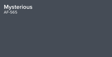
Mysterious is a very gray navy blue paint color. It has a lot of gray to it and almost reads as a charcoal.
This makes it a really great neutral option if you want a bit of a bold shade in your home.
I love it as an alternative to black for interior doors or window frames.
Click here to get a 12"x12" peel and stick sample of Mysterious.
What shades of blue did I miss?
Get paint samples!
Samplize will send you 12"x12" peel and stick samples of paint colors from many popular brands so you can see exactly how they will look in your home!
Love paint colors? Be sure to check out:
- The Paint Color Formula - my complete guide to picking paint colors!
- My guide to paint sheens
- My guide to paint undertones
Painting for the first time? Check out my video tutorial on the easiest & cleanest way to open a paint can!
Looking for something?
We've been doing this since 2012 so we have a LOT of blog posts!
Search stuff like: Ceiling Projects | DIY Plant Stands | Thrift Flips


Hello, I'm Morgan, half of the creative force behind CharlestonCrafted.com! With a passion for DIY that dates back to 2012, I've transformed three homes and now I'm dedicated to helping others craft their dream spaces. Let's turn your house into a home together!

