I love love love our coastal kitchen, but I have been itching to design a new kitchen lately. I have really been feeling rich blues paired with cool gray tones. Anyone want this look in their home? Let's do a makeover!
Anyways, I was very excited when BLANCO asked us to design a mood board for a kitchen featuring their IKON 27" sink in Concrete Gray. This sink is magical, y'all, and it really fit my vision to a T. Plus, it's new slim design means you don't have to sacrifice style if you have a smaller kitchen area.
The IKON® 27" SILGRANIT® Farmhouse Sink in Concrete Gray is perfect for small spaces. It features the timeless farmhouse style apron but is designed to fit a 30" wide cabinet. That gives it flexibility for smaller kitchens, laundry or mud rooms. The sink is engineered with the same patented, exclusive durability of SILGRANIT®. The color is throughout, and is highly resistant to chipping, fading and scratching, and is easy to clean with a smooth Hygienic+Plus surface.
While I designed this look to be a kitchen, it could so easily be a laundry room as well! If only I were so lucky as to have a sink in my laundry room, this is how I would want it to look.
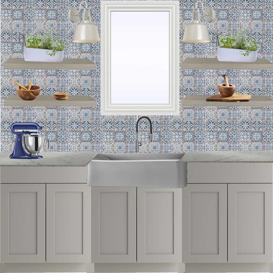
I designed this kitchen all around the Concrete Gray of the sink. Concrete Gray made me think of concrete tile which led me to this gorgeous blue and white tile from the Home Depot. I love the variation of patterns within the tile and wanted to design a kitchen mock up that would really let it shine.
I paired the sink with the BLANCO EMPRESSA™ Semi-Professional Kitchen Faucet. I have told you about the EMPRESSA faucets before, but I just love their sleek design. This model has a traditional feel with clean lines and the pull-down dual spray that I love.
To really let the tile and the sink be the stars of the show, we chose a simple style shaker cabinet for the base. The gray color picks up on the gray in the sink. We topped it with a white and gray counter top for a timeless elegant look.
We decided to forgo uppers for this view (though I couldn't imagine an entire kitchen without uppers) and instead add gray tone open shelving. I love the look of open shelving around a window and think that the shelves also help to break up the busyness of the tile.
A window is perfect over a sink, but it is always good to have more lighting options. I love the look of these white sconces - they have a bit of a farmhouse look, but the high-gloss finish modernizes them.
Accessories-wise, I think that it is important to contrast man-made elements like the Concrete Gray sink and tile with natural textures. So, I brought in olive wood accessories for that warmth.
I also love the idea of herb gardens in a window, and these white linear pots were just perfect for this space.
I pulled in a cobalt blue stand mixer to bring out the deeper blue tones in the tile. Accessories like this are a great place to pull in deep dark colors without them overwhelming the space.
I am really in love with the look of this blue, white, and Concrete Gray kitchen. I think that it could work in a variety of homes - from farmhouse to traditional - and has the perfect balance of pattern and neutrals.
If you are looking for a new sink for your home, please consider the IKON® 27" SILGRANIT® Farmhouse Sink in Concrete Gray
This post was sponsored by BLANCO. All opinions are true and my own. Thanks for supporting the brands that make Charleston Crafted possible!
This post contains affiliate links which means that if you click through and make a purchase, we receive a small percentage of the sale. Thanks for your support!
 |
|||
 |
 |
 |
 |

Hello, I'm Morgan, half of the creative force behind CharlestonCrafted.com! With a passion for DIY that dates back to 2012, I've transformed three homes and now I'm dedicated to helping others craft their dream spaces. Let's turn your house into a home together!

