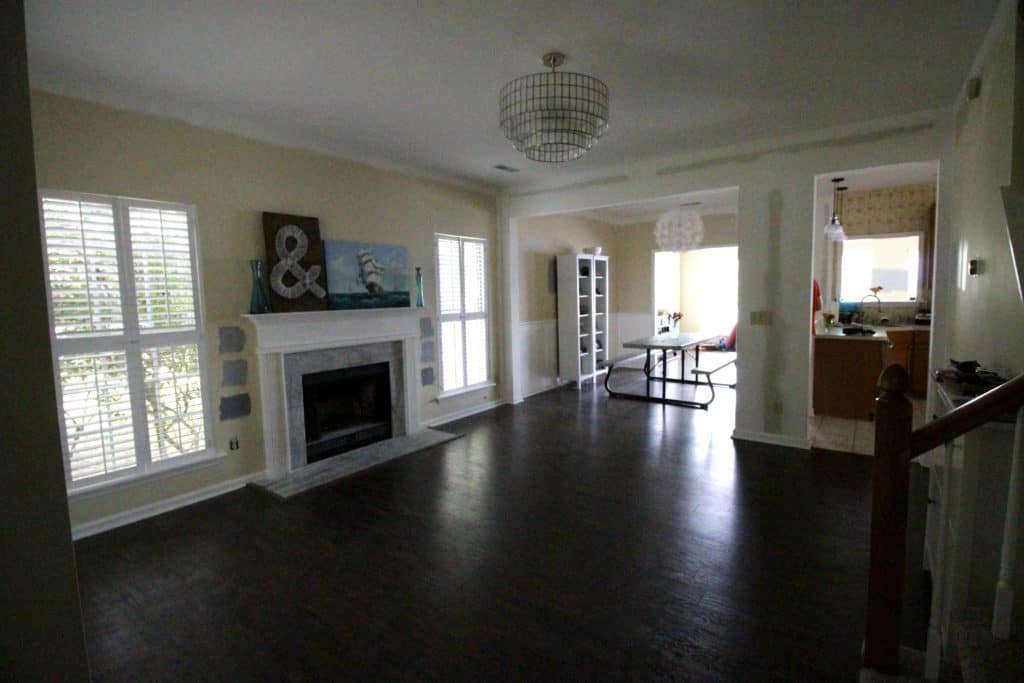
This post might be a little late since I have already been giving sneak peeks of the furniture in the space, but I wanted to go ahead and share how we decided on a furniture layout for the front room. I have always had a specific vision for the front room design-wise, but one of the hardest things for me has been figuring out the layout. While it is not a small room, it also serves as a bit of a "hallway" from the foyer to the kitchen and dining rooms. I have really been challenged to figure out a way to add a seating and conversation area without overflowing into the walking area.
To form this conversation area, I decided that I wanted two chairs and a love seat. This would allow for seating for four, which is the most common number of people that we will have in this space at once (basically, one other couple).
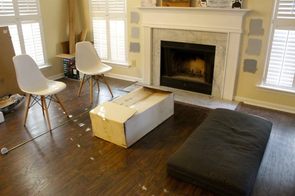
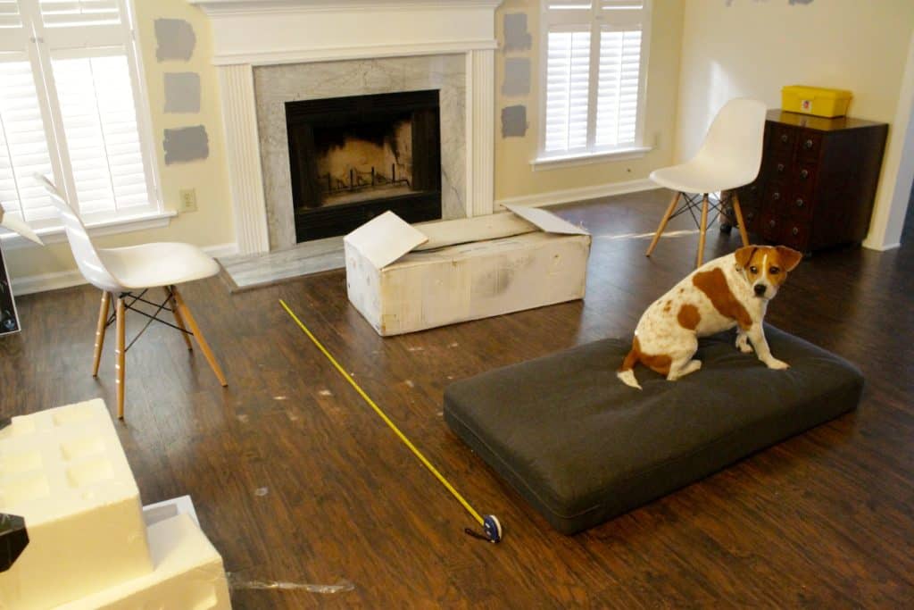
So, I decided to try a few different layouts to determine what I liked best. This was done before any painting or furniture ordering. For the purposes of this exercise, the grey cushion represents a love seat and the white chairs represent chairs. The box is the coffee table. We did this exercise before ordering any furniture and used it to decide what size of pieces we wanted for the space. Sorry this rooms so junky - like I have said, it really was the "trash room" up until September.
Option One was to have the couch and chairs facing each other over the coffee table. I like this option because it feels very cozy and conversational. I was a little bit worried about the entire thing looking too clustered together in the middle of the room with excess space on either side. But, I liked how open it felt.
The second option was to have the love seat facing the fireplace with a chair on either side. This layout felt larger and took up the space more, but felt less conversational. This layout makes it all about the fireplace and really draws your eye there. I think that this would be the way to go (with the chairs angled slightly towards the fireplace) if we were hanging a TV up there. Who knows, if one day the sunroom becomes a kid's playroom and we want a second TV room, it might evolve this way.
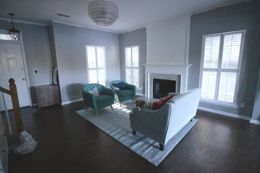
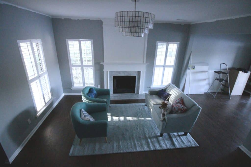
In the end, we chose option one, which I felt was more conversational. Here is a semi-cleared out shot of just the furniture, pre-coffee table. This was taken from halfway up the stairs and lets you see my one pet peeve of this space - the blank space behind the chairs and loveseat. It looks worse in this bird's eye photo than at eye level (not on the stairs) but it draws attention to my problem. I didn't want a bigger rug (this one is 6.5' x 9.5') because the area towards the bottom of this photo is the walkway from the entry to the kitchen and I knew that a rug would get really beat up being the first thing people walk on every time they walk in the door. I was unable to find any budget-friendly rugs that were longer than 9.5' without being any wider than 6.5'.
So, I am going to try to make the space feel more full with accessories - mainly plants and art. One of the biggest difficulties for me in design is knowing when to stop adding or changing things, so I am really hoping that this room can be edited down and beautiful without getting junky or cluttered.
Any advice?!
 |
|||
 |
 |
 |
 |

Hello, I'm Morgan, half of the creative force behind CharlestonCrafted.com! With a passion for DIY that dates back to 2012, I've transformed three homes and now I'm dedicated to helping others craft their dream spaces. Let's turn your house into a home together!

