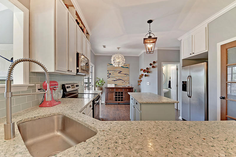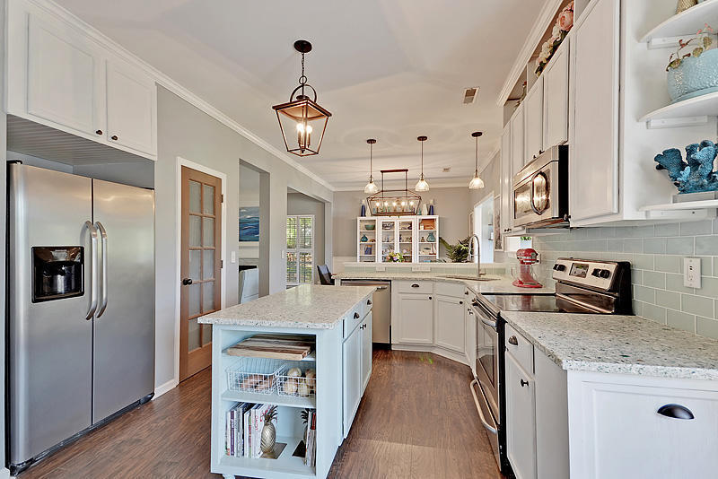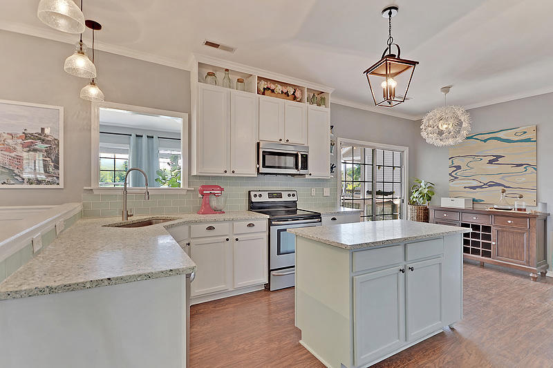
Our kitchen was our biggest and my favorite transformation in this home!
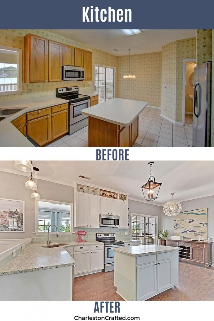
When we first toured the house, the kitchen was really scary! Dated oak cabinets, plastic counter tops, and loads of wallpaper.
We completely renovated - but on a budget. By keeping the cabinets and layout, it was much more affordable.
Our sea glass and oyster shell countertops are the clear highlight. This is a beachy paradise now!
Our plan:
- Scrape ceilings - we had new drywall hung over the popcorn downstairs!
- Add crown molding - we added crown molding throughout the entire downstairs.
- Remove wallpaper - this was a surprisingly easy DIY!
- Paint walls - our entire downstairs is painted Online by Sherwin Williams.
- Remove door and open up doorway - we had the wall between the formal living room and the dining room and dining room and kitchen removed by a contractor. It was load bearing and $$$ but completely worth it.
- Organize and re-design the pantry - we added a custom wooden organization system to the pantry, and gave it a new vintage door.
- Replace flooring - we had the same flooring that the previous sellers installed downstairs installed in the kitchen in lieu of the tile.
- Phase 1: paint cabinets - we painted our cabinets a two tone look - Sherwin William Watery (a minty green) for the island and white everywhere else.
- Phase 2: fully gut! - we decided not to fully gut this kitchen and instead worked with the existing layout!
- Create an eat-in area - we had big plans to add a built in eat in area with a banquet, but after living in the space we decided that it was better used for the bar!
- Update lighting - we replaced all of our downstairs lights with lanterns.
Other projects we did:
- Custom countertops - we designed and had custom sea glass and oyster shells made by a local company that focuses on sustainability and recycling!
- Cabinet extensions - we used the upper cabinets that were removed from our taken down wall to add a built in bookshelf and tilt out trash can, before running countertops over them.
- Extend cabinets - We extended our upper cabinets to the ceiling before adding crown molding to the whole room for a dramatic and budget-friendly upgrade.
- Slow close hardware - we added slow close hardware to all of the cabinets and drawers for an upgraded feel.
- Wood grain art - I painted a large piece of plywood to look like water ripples!
- Sea glass backsplash - we hung a sea glass subway backsplash to play off of our new countertops.
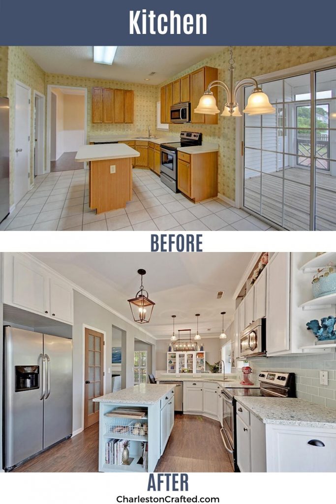
When we were house hunting, I really wanted a kitchen that was un-updated. Well, that's what I got!
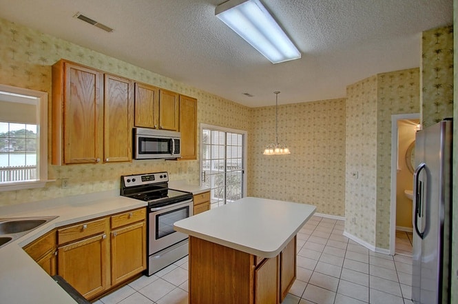

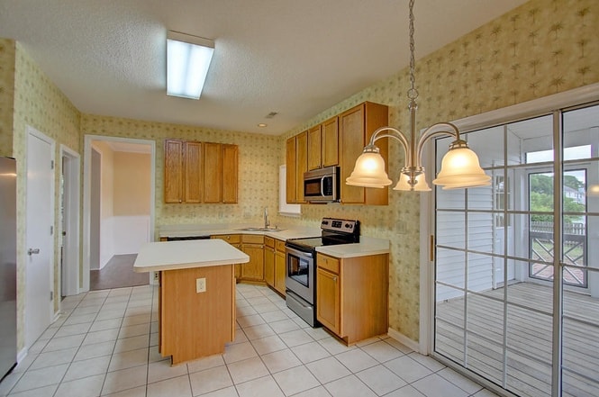
The first thing that we did was have the wall between the kitchen and the dining room taken down. It looks so great and much more open.
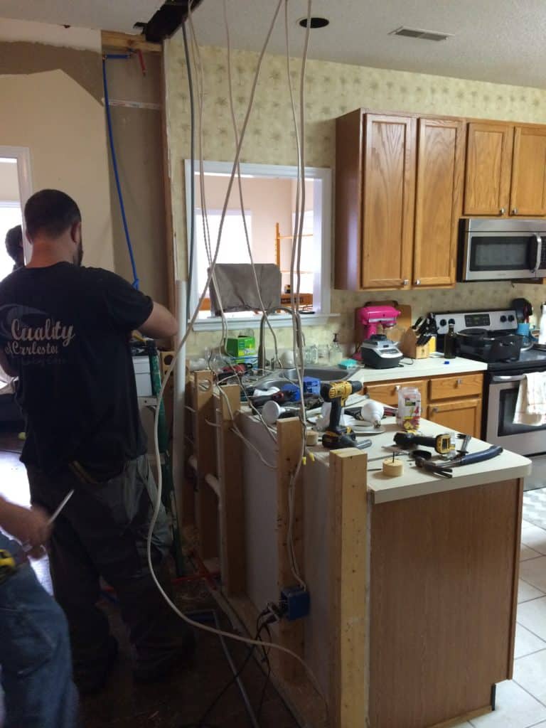
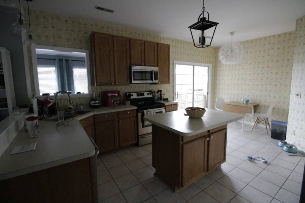
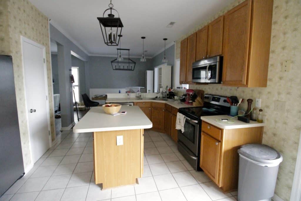
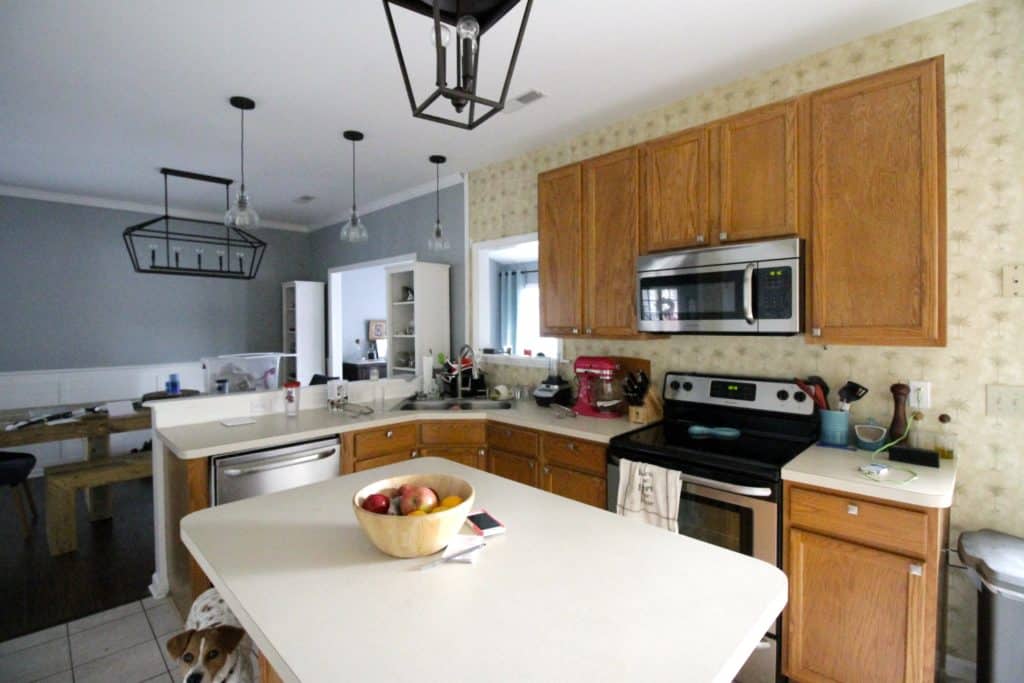
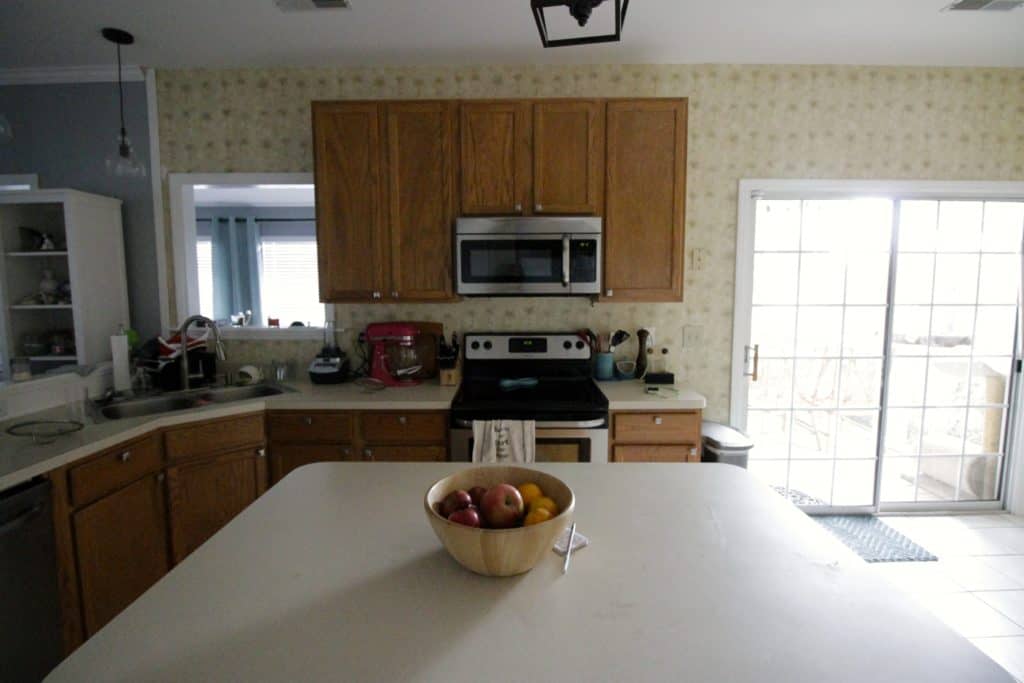
We are in the middle of a big kitchen makeover. Here is our full plan and makeover!
The paint color is Sherwin Williams Online color. Be sure to check out my favorite blue gray paint colors!
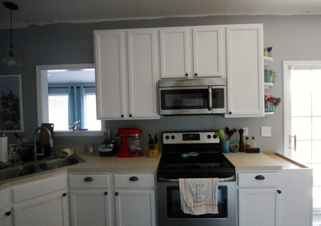
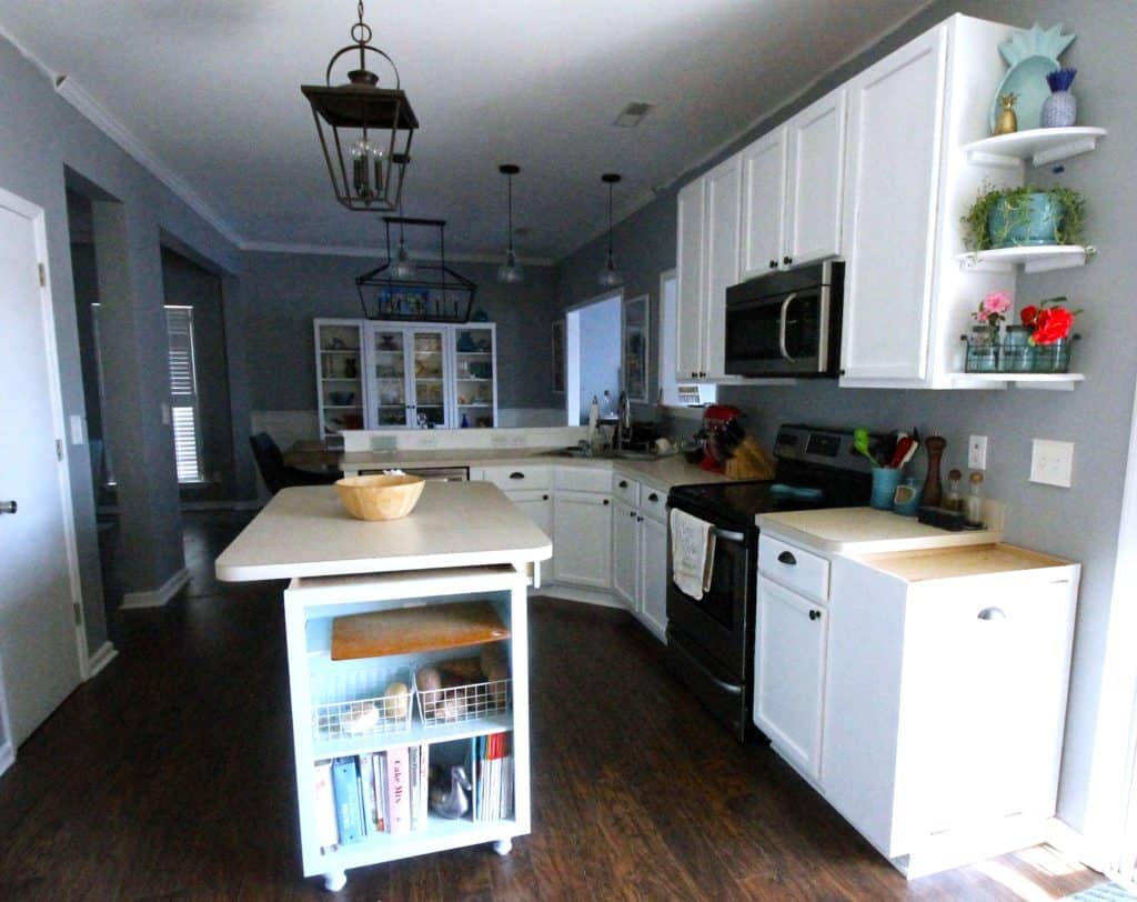
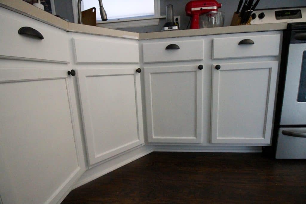
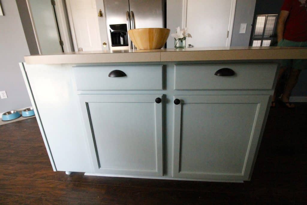
As you can see, the whole thing has been brought together with similar color tones and coastal patterns.
Our number one goal was to make our kitchen look light and bright and open. The kitchen was so closed off until we had the walls taken down, but then it was still yellow and brown.
On the end of the island and the counters, you can see two of our unique projects that we started off with, where we used old upper cabinets to turn into open shelving on the island and a tilt out trash can.
Then we got to work.

We started by tearing down the old palm tree wallpaper that was gracing our walls and carried in the Sherwin Williams Online (light grey) color into the room, which matched what we had done on the rest of the first floor.
Morgan painted this incredible wood grain art using left over paint from lots of our other projects, really pulling in the colors from around our home.

After that, we painted the cabinets. We did white on the main cabinets and Sherwin Williams Watery on the island.
When we decided we weren’t going to change the layout of the kitchen, we decided to save thousands of dollars by just painting the cabinets and adding slow-close drawer and door hardware.

After the cabinets were done that were in place, we extended them to the ceiling to make open shelving above the cabinets.
This is so incredibly simple by adding a few pieces of wood and running crown molding around the sides and front when we added that all around the kitchen.
We also added a little bit of open shelving to the right of the cabinets to fill in that space.

Next up came the most beautiful and unique part of our kitchen. We bought recycled glass countertops from Fisher Recycling and got to pick out our exact design.
We took off the old laminate countertops ourselves and then had the new countertops professionally installed.
These counters are our unique design and are the most coastal thing we have in the kitchen. They bring together our whole vibe.

We installed a custom backsplash of frosted sea glass subway tiles from Tile Bar. They match the glass in the countertops perfectly and really and truly make the space.

We also ordered a brand new faucet to go with our new design. We got a single bowl, under-mount sink from the countertop installers and ordered our chef’s faucet from Costco.

We pimped out our pantry, creating custom wood shelving that fits all of our dry goods as well as our coffee maker and toaster inside.
Then we found an old wooden door and gave it an overhaul to really complete the space.

The last project we did was to bring forward and raise the dinky above the fridge cabinet that was tucked away and unusable.
We brought it forward to match the crown molding and used bead board underneath to make it look very deep.

Oh yeah, and one other project (and one of only two things we didn’t do ourselves) was that we had the hardwood floors run into the kitchen to match the rest of the first floor.
We had a number of reasons for why we hired it out, and we definitely made the right decision.
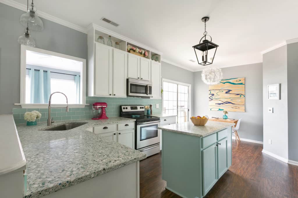
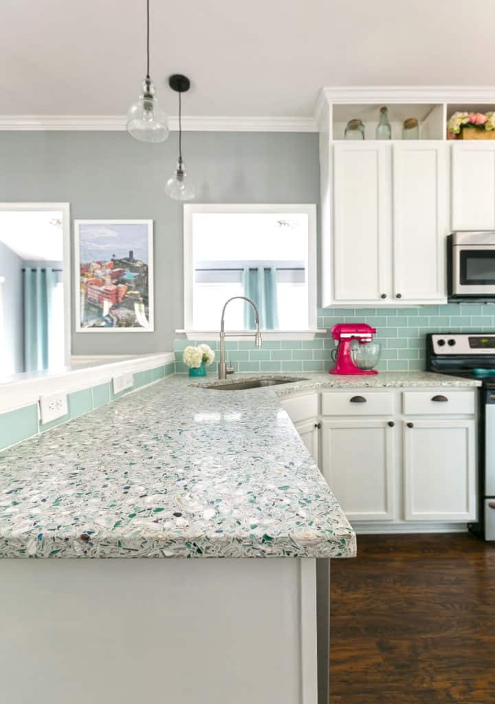
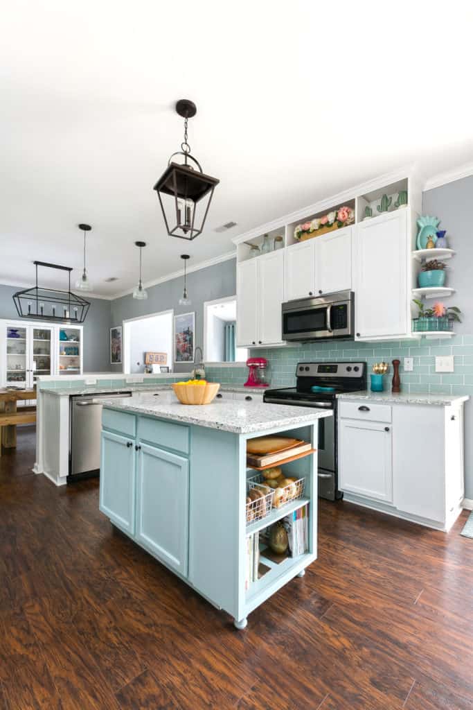
After hours and months of work, our DIY coastal kitchen is done and, if we don’t say so ourselves, beautiful.
This turned out exactly how we wanted. But you would never think it if you look back at some of the photos of how the kitchen was when we moved in!


We also decided to move the bar from the sunroom to the eat in kitchen area. This was to free up space in the sunroom for Luke's toys, but also because we no longer used the eat in kitchen to eat anyways!
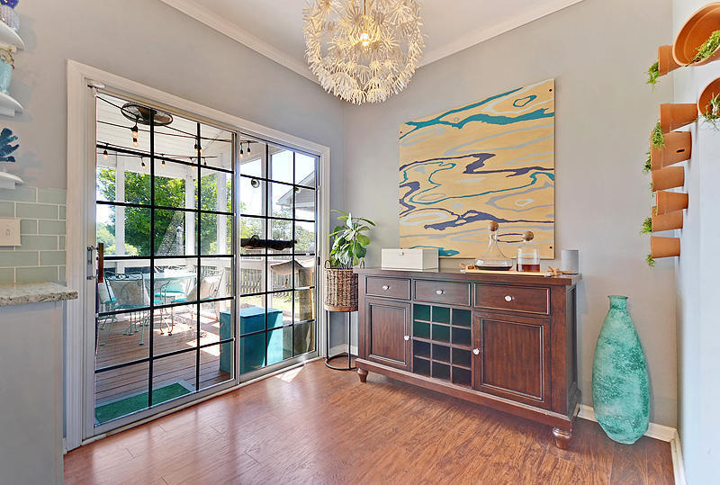
I love this kitchen and am SO proud of what we accomplished. It definitely sold our house, added a lot of value to our home, and was my favorite space in the house!
