Struggling to match your walls with your furniture? Learn how to coordinate paint colors with furniture and decor using simple tips for a stylish and cohesive home.
Painting is such an easy and affordable way to transform any room in your home. But, that doesn't mean that it's still can't be overwhelming, especially if you've never done it before.
Of course, it's easier to plan to decorate a home that is being completely gutted and redone. But for most people, that's just not realistic.
It's important to be able to plan a design for your home that works around the existing furniture and decor.
Picking the right paint color for your walls when you already have furniture might feel a bit tricky, but it's totally doable!
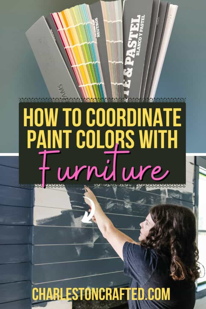
How to Coordinate Paint Colors with Furniture and Decor
The goal here is to create a space that feels cohesive and makes your furniture shine. Here are my best tips and tricks for getting this just right.
NOTE: I have used AI generated photos in this article to demonstrate some dos and don'ts. This is because I do not want to use any designer/homeowners photos and call them "wrong". I think that's mean! I prefer to use fake robot photos instead. I hope they help to illustrate my points!
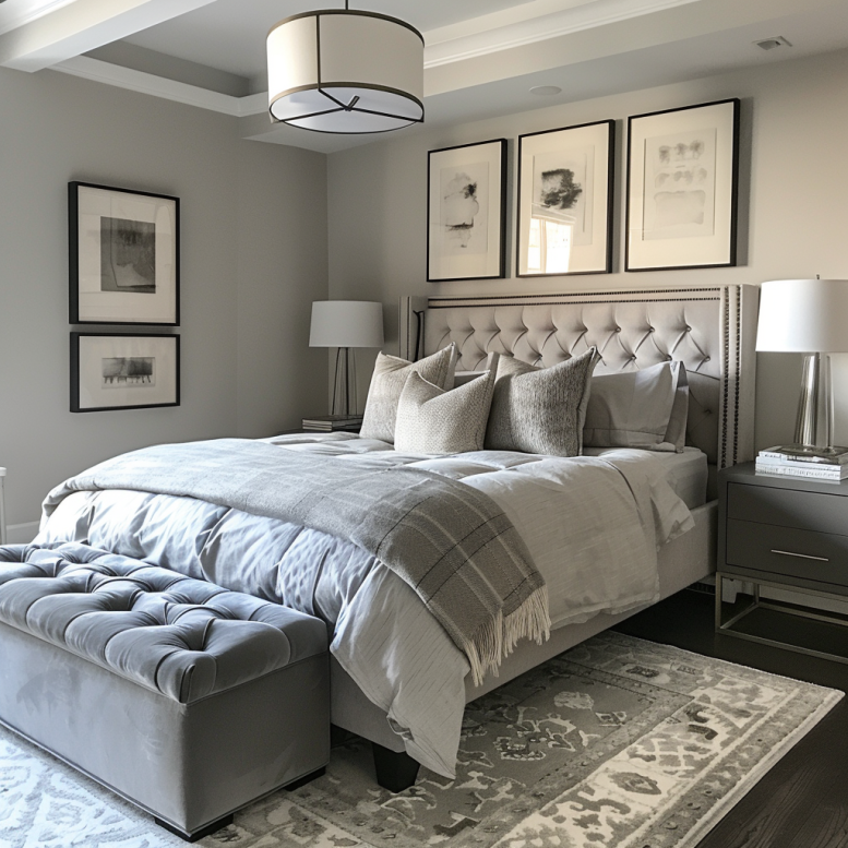
Skip the Monochrome Overload
First things first, let’s talk about monochrome. It’s tempting to go all-in on one color, but trust me, it can make your space feel flat and boring.
Imagine your walls, furniture, floor, rug, and accessories all the same color. It just gets flat and boring!
Instead, if you love a monochrome look, mix it up with different shades or depths of that color to keep things interesting.
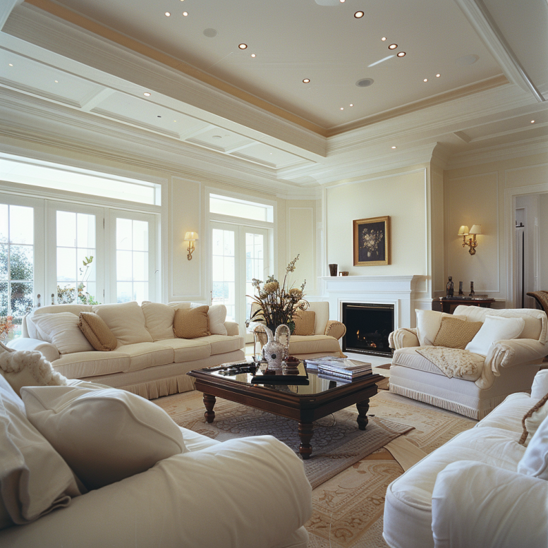
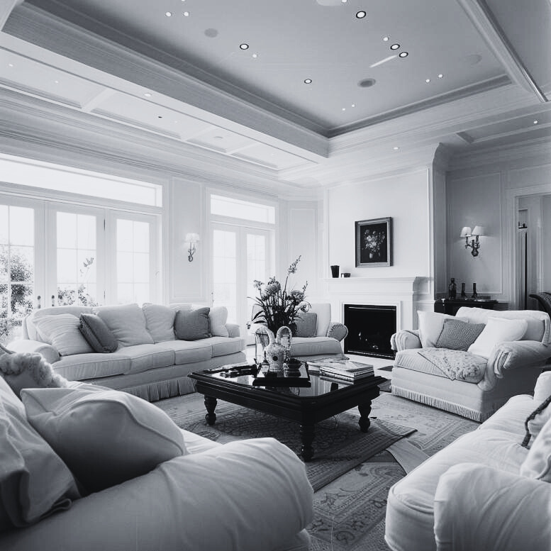
I like to imagine (or actually do!) taking a picture and changing it to black and white/grayscale. You want there to be various shades - even in grayscale - to have different levels of depth and interest in the space.
For instance, if you have light blue furniture, think about painting your walls a darker shade of blue. This contrast not only adds dimension but also makes each piece stand out, without pulling too many different colors in.
On the flip side, if your furniture is dark, lighter walls can brighten things up and keep the room from feeling too heavy. It's all about the contrast! Speaking of...
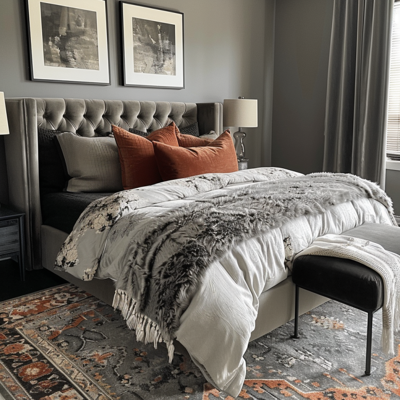
Embrace Contrast
Contrast is a fantastic way to make your furniture pop and add some visual excitement to your room. If you’ve got light-colored furniture, darker walls can really make those pieces stand out. Think about a soft beige sofa against a deep navy wall – it creates a striking focal point that’s hard to ignore.
Similarly, if your furniture is on the darker side, like a mahogany dining set, lighter walls can help balance things out and keep the space feeling open and airy.
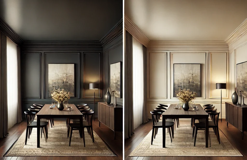
When you use contrasting colors, you’re essentially drawing attention to both the furniture and the walls, creating an interesting balance between the elements in the room.
This approach works particularly well in rooms where you want to highlight specific pieces of furniture, such as a statement armchair or a beautiful dining table.
If you’re not sure where to start with contrast, consider the color wheel. Colors that are opposite each other on the wheel are called complementary colors and naturally create a high-contrast look.
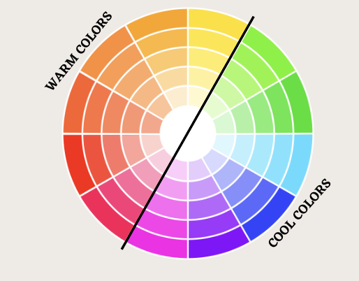
For example, if your furniture is green, a red-toned wall will create a vibrant, energetic contrast. If that feels too bold, you can tone it down by choosing softer shades of those complementary colors - or neutrals, like shades of beige or gray - with those undertones.
Another way to embrace contrast is by mixing and matching different color values. This means combining light and dark shades within the same color family.
For example, if you have a dark gray sofa, you might choose a lighter gray or even a soft white for your walls. This allows you to play with contrast without straying too far from your main color palette.
Pick Complementary or Tertiary Colors
Another great trick to create a harmonious yet interesting space is to use complementary or tertiary colors from your furniture.
- Complementary colors are those that are opposite each other on the color wheel, like blue and orange or red and green.
- Tertiary colors are made by mixing primary and secondary colors, giving you more nuanced hues like blue-green or red-orange.
These color schemes can add depth and vibrancy to your room without overwhelming it.
Instead of trying to match the exact color of your furniture, which can make the space feel too uniform, look for inspiration in the other elements of your room.
Art and textiles are fantastic sources for finding complementary or tertiary colors. If you have a beautiful painting with a mix of colors, pick a hue that complements your furniture and use it as your wall color. This method ties the room together and creates a cohesive look that flows naturally.
For example, if your furniture is primarily blue, a painting with warm orange tones can inspire a complementary color scheme that feels balanced and engaging.
Rugs and pillows are also excellent for finding coordinating colors. A rug with intricate patterns and multiple colors provides a palette to work from.
Choose a secondary color from the rug to paint your walls or for other accessories like curtains and throw pillows. This way, your room will have a layered, designer feel without being overly coordinated.
Using complementary or tertiary colors not only adds interest but also maintains balance and harmony in the room.
Don’t be afraid to experiment with different shades of these colors. A bold hue on a small accent wall or as part of a pattern can add just the right amount of contrast and interest.
On the other hand, softer, muted versions of complementary or tertiary colors can provide a more understated elegance, perfect for creating a calming environment.
Remember:
- Start Small: If you’re unsure about a bold complementary color, start small with accents and build up.
- Test Colors: Always test paint colors on your walls before committing. Colors can look different depending on lighting and surrounding decor.
- Stay Flexible: Be open to adjusting your choices as you see how colors interact in your space.
By picking complementary or tertiary colors, you can create a visually appealing room that feels cohesive and dynamic.
This approach allows you to highlight your furniture and other decor elements in a way that feels natural and well-balanced.
More things to keep in mind when choosing a paint color
Here are a few more tips to consider when picking the perfect paint color!
Think About Color Value
When picking your paint, consider the value of the colors you're using—the lightness or darkness of each hue.
Mixing different values can help prevent your palette from looking chaotic and instead, create a balanced and visually appealing space.
Use Similar Undertones
If you have an open floor plan, using colors with similar undertones throughout the space can create a nice, cohesive flow. Whether you prefer warm or cool tones, keeping them consistent helps tie everything together.
Experiment with Shades
Matching your furniture to your walls doesn’t mean they have to be the exact same shade. Using different shades of the same color can add depth and dimension, making your space feel layered and interesting.
For example, if your walls are a soft gray, you could choose a darker charcoal for your furniture to create a subtle, sophisticated contrast.
Also consider bringing in different textures in the same color. If you want all white accessories and white walls, mix smooth white leather, a white shag rug, a white knit pillow, and a white velvet blanket for textural interest without more colors!
Tie Everything Together
Finally, don't forget about the little details. Look for opportunities to tie your color scheme together with accents and accessories.
Throw pillows, artwork, and rugs can all play a role in reinforcing your chosen palette and making the room feel cohesive.
Remember, decorating is a process, and it’s okay to experiment with different looks until you find the perfect balance.
Try sampling paint colors on your walls and see how they look next to your furniture in different lighting conditions.
Sometimes, the color that looks perfect in the store can appear completely different once you get it home.
By following these tips, you can confidently pick a paint color that complements your furniture and creates a beautiful, harmonious space. Happy decorating!

Click here to learn my simple step by step process to pick the perfect paint color every time!

Looking for something?
We've been doing this since 2012 so we have a LOT of blog posts!
Search stuff like: Ceiling Projects | DIY Plant Stands | Thrift Flips

Hello, I'm Morgan, half of the creative force behind CharlestonCrafted.com! With a passion for DIY that dates back to 2012, I've transformed three homes and now I'm dedicated to helping others craft their dream spaces. Let's turn your house into a home together!