We have had so much fun decorating Rory's room. I always wanted to do a pink room and you know that a baby girl's nursery was the perfect opportunity.
While I wish we could have had this space ready before she was born, moving a week before her birthday meant it just wasn't happening!
Regardless, I am so happy with how it turned out.
Tour our modern girls nursery
We didn't really go with a "theme" in here (compared to Luke's very themed jungle bedroom).
Instead, I went for all things happy and bright.
The color scheme
When decorating any room, I suggest first coming up with your color scheme.
I actually started with the teal dresser color - Behr Tower Bridge - since we were re-using the dresser/changing table from Luke's old room.
I knew that I wanted a pink for the walls. I sampled a lot of coral-based shades of pinks before settling on Coral Fountain, also by Behr.
Then, for accent colors I pulled in white, light/whitewashed wood, and a few pops of gold.
I really love the teal and the pink together - it makes it a little more modern and interesting than just pink and white!
When I was a tween, hot pink and turquoise were my jam, so this is kind of my modern take on that color scheme.
The paint job
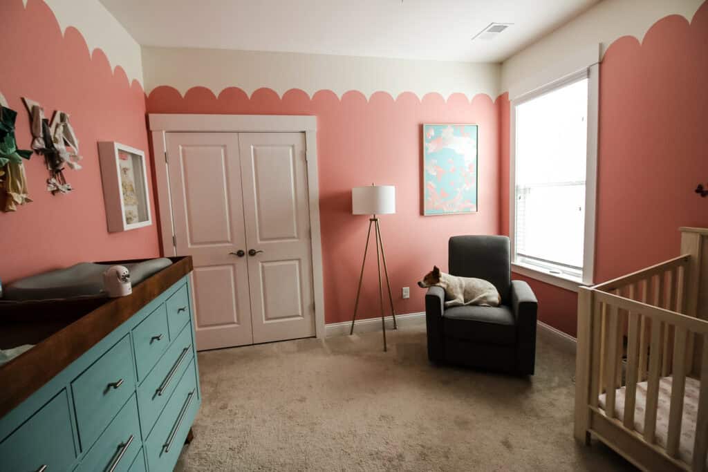
To make the walls a bit more interesting than just plain pink, I painted a ¾ scallop border with white on top and pink beneath.
I absolutely LOVE how it turned out. We have pretty high ceilings in here for a second floor (9 foot) and it really draws the eye up and keeps the pink from being overwhelming.
The upper color is Behr's Papier Blanc, which I picked to color-match the creamy white ceiling color as closely as possible.
The crib
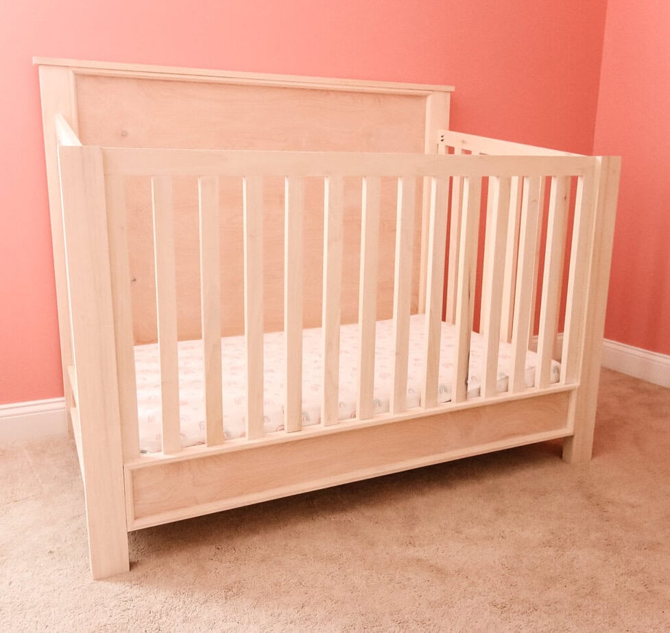
The star of this room is really the beautiful, modern traditional white washed crib.
Sean built this crib completely from scratch. Which, even with the current high prices of lumber, was still cheaper than the $1,000 Pottery Barn crib we pulled inspiration from.
We paired it with the Eclipse Wellness 2-Stage Hybrid Pure baby mattress, which is double sided with sides for both infants and toddlers.
The butterfly "mobile"
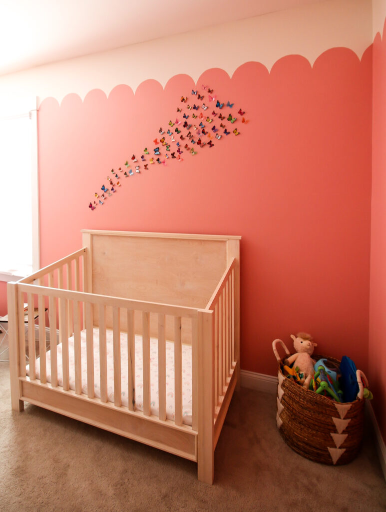
I wanted to have a mobile of butterflies in flight over the crib. However, I didn't like the idea of tons of strings hanging down.
So, I instead hung a butterfly accent wall! I love how it turned out and that it brings color into the space. Does it get any more "happy" than a swarm of butterflies?!
The bookshelf
We wanted to give Rory her own bookshelf so that we could move some baby board books out of Luke's room and make it easier to pick books to read her at bedtime.
Plus, reading is one of Luke's favorite activities and we really want to encourage that with her, too!
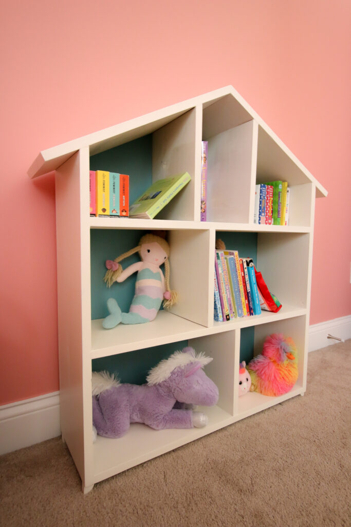
To make this bookshelf more fun, Sean built a house-shaped shelf! We have free woodworking plans for this dollhouse bookshelf.
This shelf is perfect for books, toys, and will be great for using as a doll house down the road!
**always be sure to properly secure shelves like this in kid's spaces to the wall to avoid tipping**
We painted the bookshelf white and the backer that same blue Tower Bridge to tie it all together.
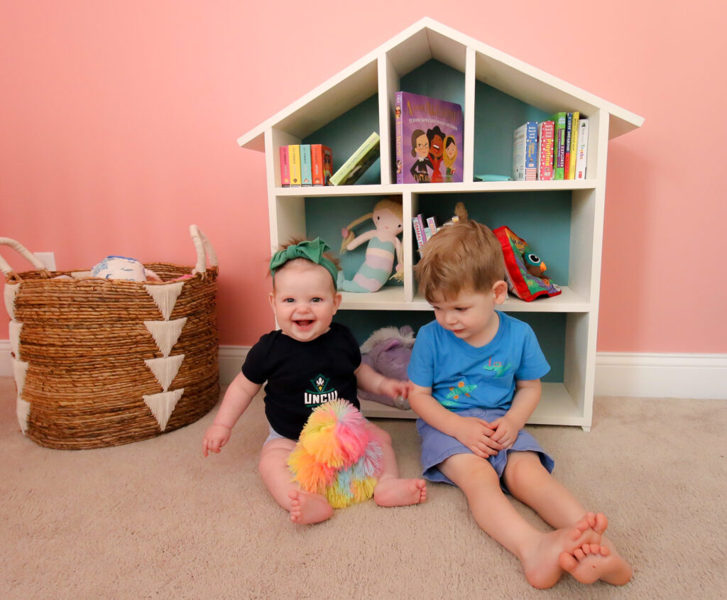
I recognize that the wall around this shelf looks kind of blank. It's honestly bothering me! But - let me explain.
Right now, her room is set up as a baby room. But, since she's already 9 months old (!) we know that she will be a toddler really soon.
We stopped using a changing table for Luke around 18 months and moved to just changing his diaper on the floor since he was so big and on the move. Rory is larger than he was, so we assume we will stop needing a changing table in the next six months.
At that point, we are going to ditch the giant dresser and instead get a smaller dresser for inside her closet (just like in Luke's closet. Like, identical.)
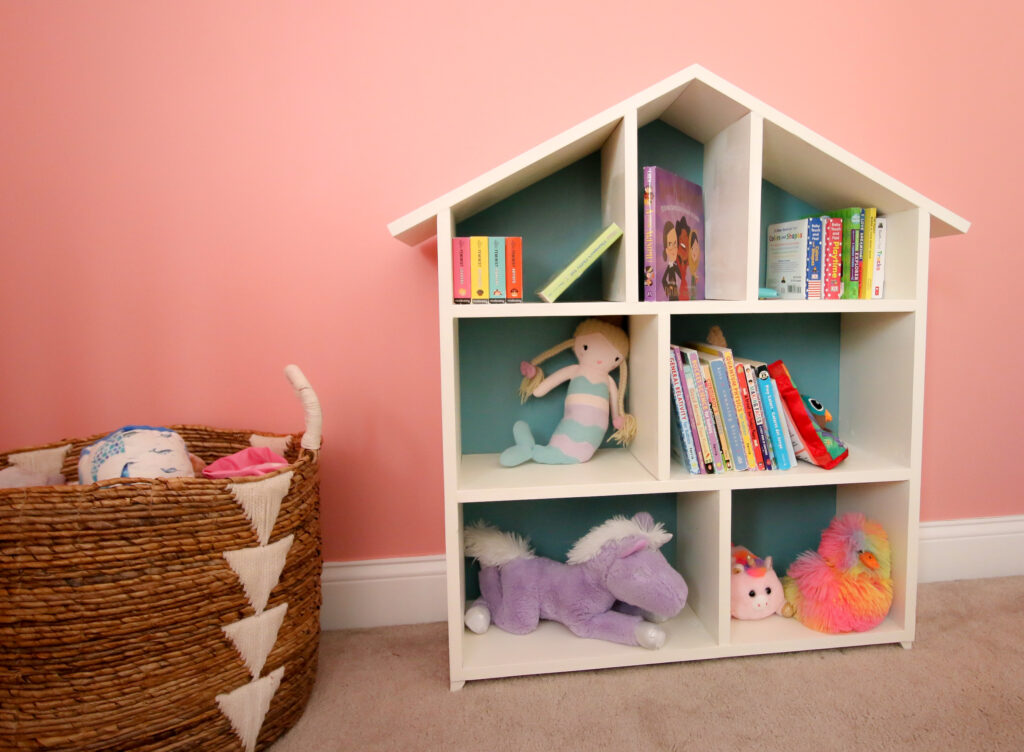
At that point, we will move this bookshelf to where the dresser is and then bring in more toy stuff - maybe a dress up station, or play kitchen, or whatever she is into!
So, I decided to leave this wall a bit blank for now, and to reassess it in six months when we move the book shelf!
Whew, did you hang for all that?! Let's move to the next corner.
The glider corner
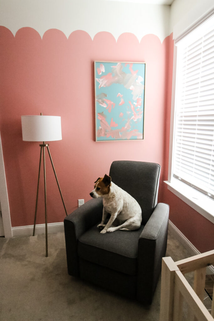
I am grouping this whole corner together, but this is the corner by the window where I have the rocker/glider.
This chair was from BuyBuyBaby in 2018 and is unfortunately no longer available.
Next to the chair I put this tripod lamp plugged into a smart plug (read about our smart nursery tips!).
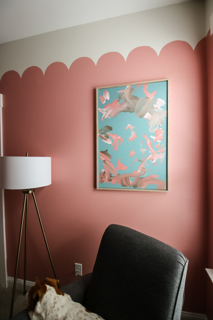
Over it all is my favorite thing in the whole room - the art painted by Luke! This is a 24"x36" canvas that I painted Tower Bridge (the teal color) and then let Luke paint!
Then, Sean framed it with scrap whitewashed oak wood. I (probably delusionally) think it looks like an expensive piece of modern art but it really makes me happy because it was something Luke made for his sister!
The closet
Rory's closet was a bit of a disaster before. It was full of bins of too big and too small clothing for both her and Luke.
One of the biggest projects in this whole room was emptying it out! Sean took over sorting all of the clothing (to be honest, getting rid of baby clothes is kind of emotionally hard for me, I attach memories to clothing.)
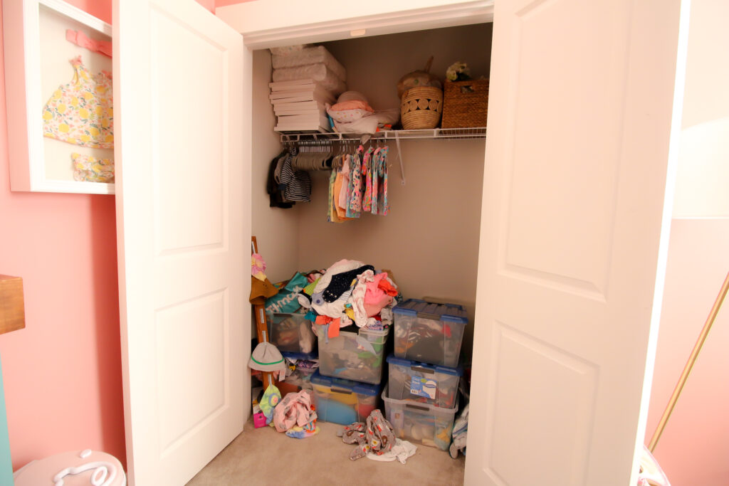
We sold and donated a ton of stuff and were able to pare it down a lot.
Then, Sean installed new wooden shelving and painted the inside pink!
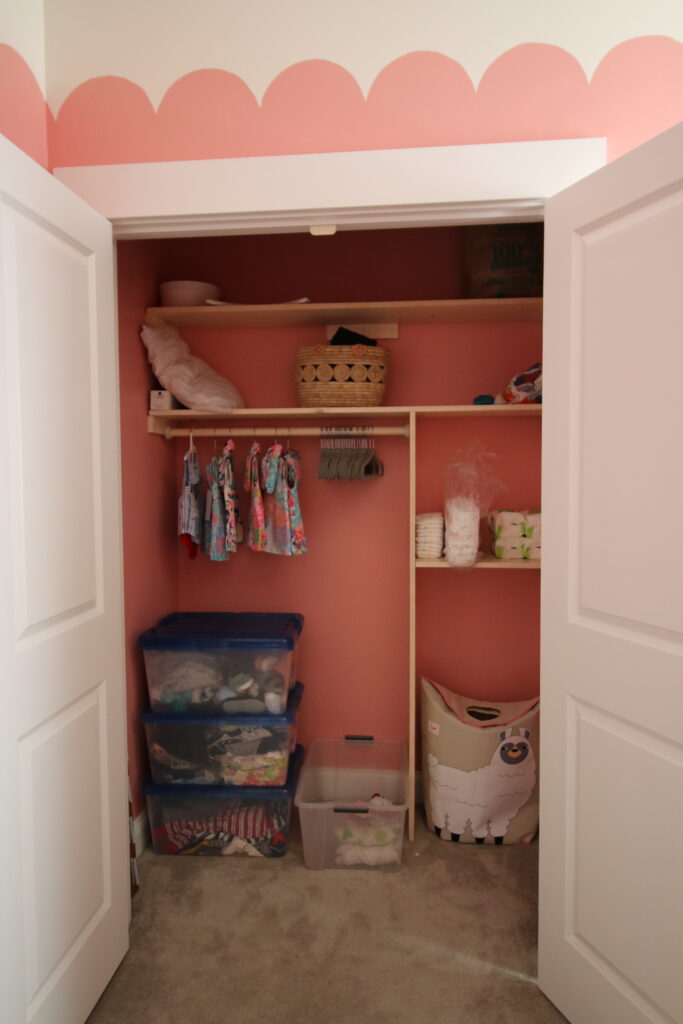
We stacked a couple of bins of too big clothes in here, but like I said earlier, once she no longer needs a changing table we will swap in a slim dresser.
The changing table
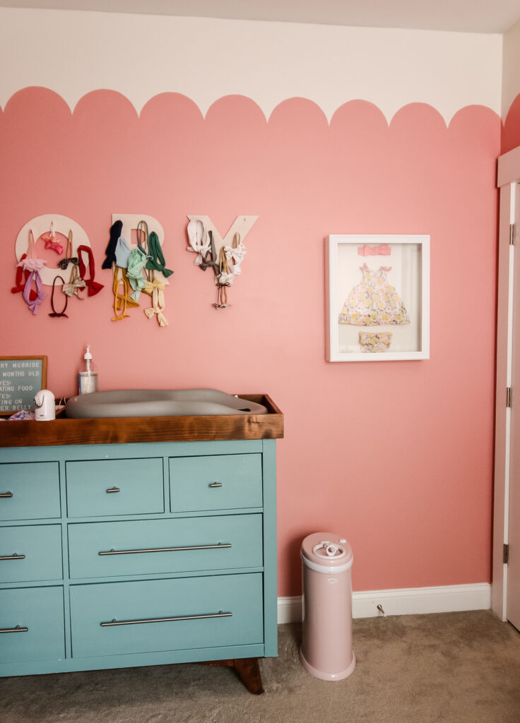
We are using this behemoth Ikea Hemnes dresser as a side table again. This is the table we made over and built a changing table topper for Luke's room.
Like I mentioned, this is the biggest "temporary" part of her room. I honestly can't wait to get it out of here because it is huge and the bottom two drawers are actually empty. LOL!
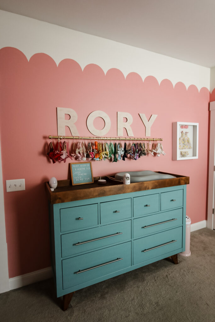
We used wooden letters to create a monogram for Rory, too. We actually made this back when Rory was first born, and now it is overflowing with bows! I then made a bigger bow solution to hold her big collection.
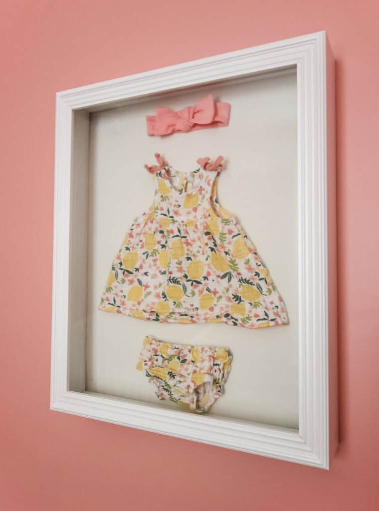
I also hung a shadowbox with her coming home from the hospital newborn outfit in it. Another favorite moment for me in this room!
The ceiling fan
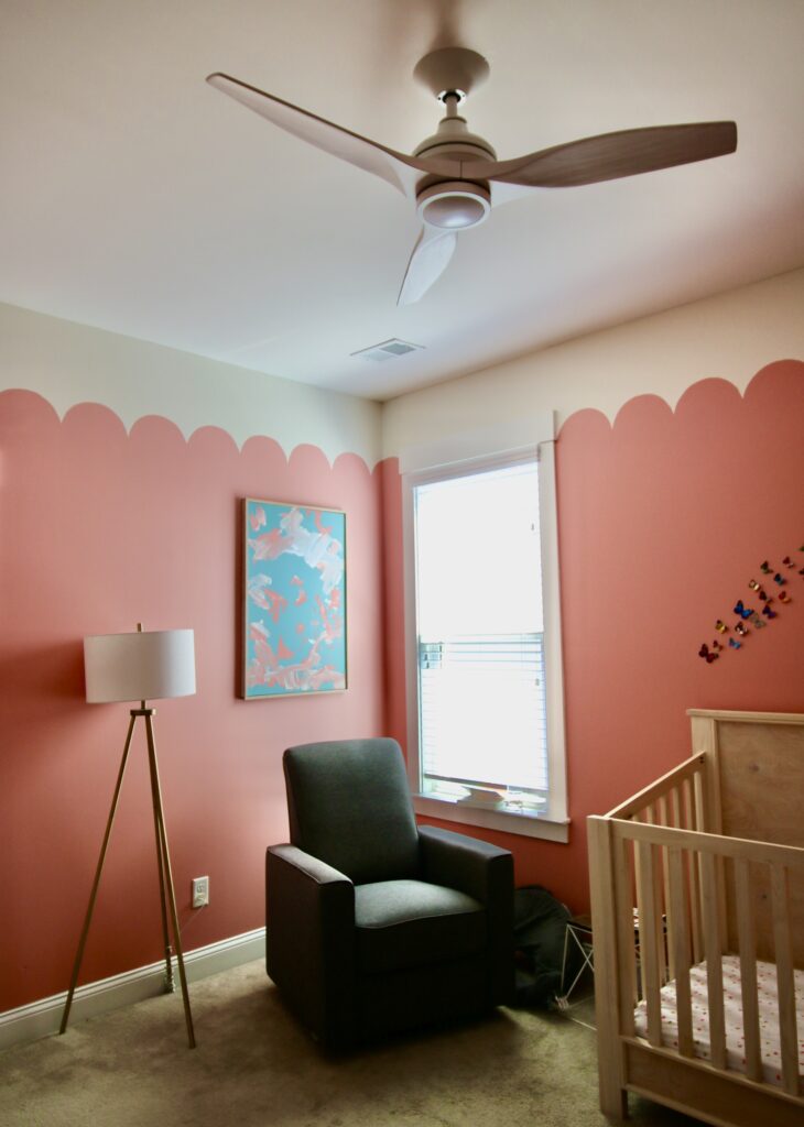
Don't forget the gorgeous ceiling fan! It is the Spitfire by Fanimation in white, with a light kit.
I know that ceiling fans are controversial in design, but they are a must in bedrooms in the south. This one is GORGEOUS and modern. We went with a white color so it will match any decor we put in here!
I absolutely love Rory's room and can't wait to watch it grow with her!
What do you think of our pink scalloped nursery?!
Looking for something?
We've been doing this since 2012 so we have a LOT of blog posts!
Search stuff like: Ceiling Projects | DIY Plant Stands | Thrift Flips


Hello, I'm Morgan, half of the creative force behind CharlestonCrafted.com! With a passion for DIY that dates back to 2012, I've transformed three homes and now I'm dedicated to helping others craft their dream spaces. Let's turn your house into a home together!





Ivory says
Your kids are soooo adorable. Your four legged baby is to. I love everything you did in this room. Fantastic job. What a beautiful space your little one has.