We've spent the last couple of months making massive changes to our gathering space, here's the reveal!
Y'all have been following along for a while, but we are finally able to reveal the total makeover on our "gathering" space in our new home.
During the first year of moving into our new home, we focused on making over our son's jungle room and our daughter's modern pink room and functional spaces like our modern boho laundry room and garage workshop.
After a year in our home, we were finally able to focus on the main living space in our home, officially called the "gathering" by the builder.
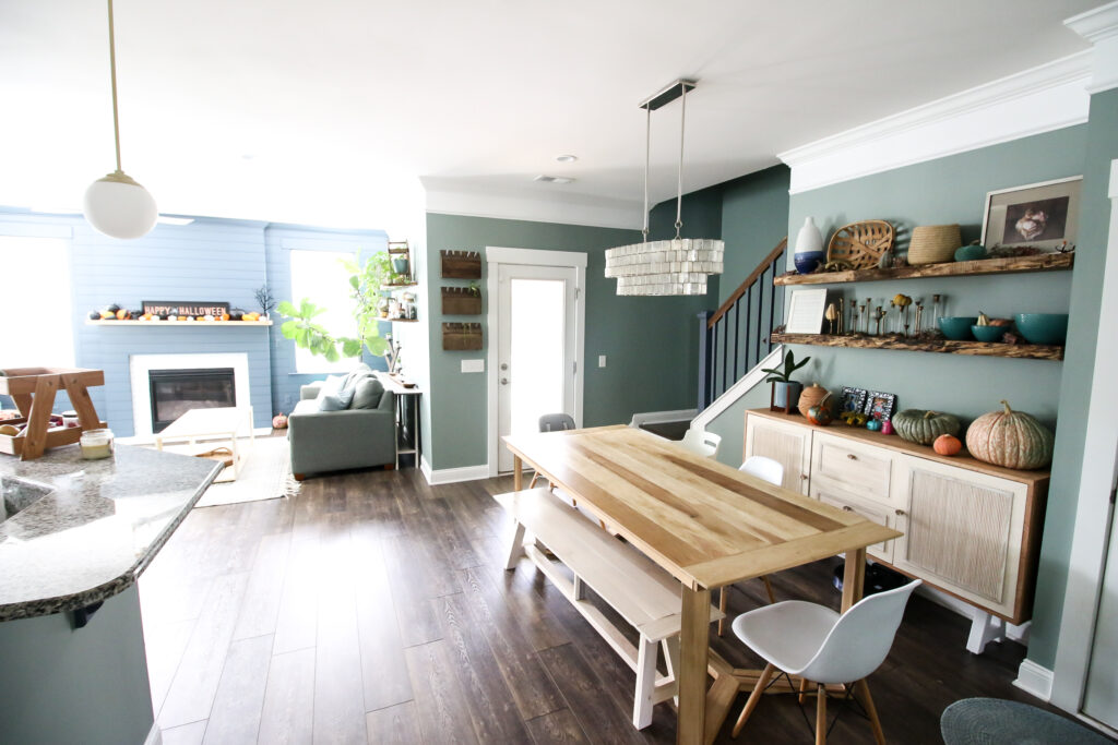
The gathering space consists of our living room, kitchen and eat-in dining area.
We have been systematically working on each of these spaces and have shared all the projects with you, but we want to bring all these together in one massive room reveal.
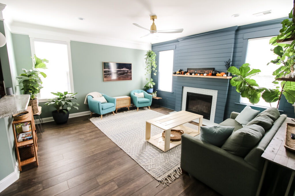
We'll break this room reveal down by each space within the gathering, so be sure to check everything out to see which projects you might want to replicate in your home!
Gathering Reveal Projects
Overall, we did a ton of projects that spanned several months. Most of the projects were individual and were focused more on specific spaces, two of our projects spanned each of the three spaces.
We started by painting all the walls in each room.
The color we chose was "Nature's Gift" by Behr and we carried it through the entire gathering and also up the stairs and into the main hallway in our second floor.
We felt it was important to have the same paint color visible from all angles and make sure that there weren't strange transitions.
This green color is really earthy and homey and feels natural in our space. We wanted something that was going to fit with the elements of our home we weren't changing for some time.
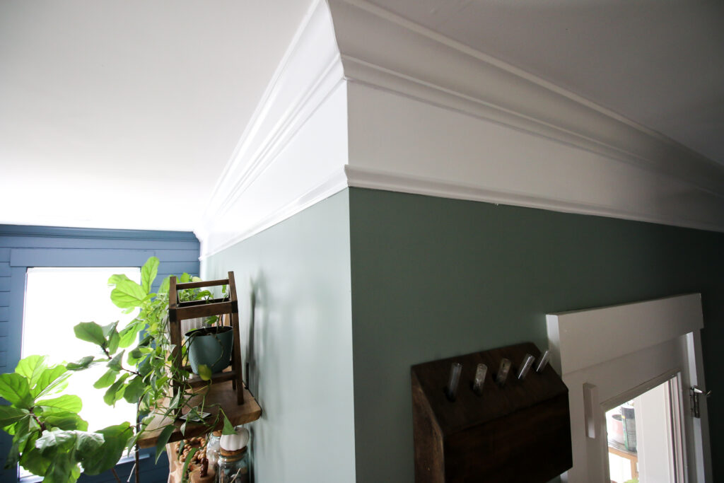
When we painted, we stopped painting a few inches below the crown molding throughout the space.
That's because we wanted to extend the crown molding down using a little trick that was already in the entryway of our home.
The builder extended the look of the crown molding in the entryway by nailing base cap molding 6" below the crown molding and then painting with trim paint in between.
We continued this look throughout the gathering space by nailing base cap at the same spacing below the crown and painting in between.
Many people on our viral TikTok post about this said we did it too low for our 9' tall walls, but we were continuing the same look that was already done.
To replicate this look, you might want to go with a little less space, but either way, no, it doesn't make the ceiling look lower.
Living Room Reveal
The living room is where we had the most projects and created the most dramatic difference.
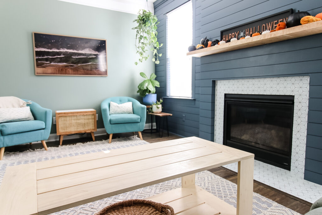
This space is highlighted by our DIY shiplap fireplace accent wall.
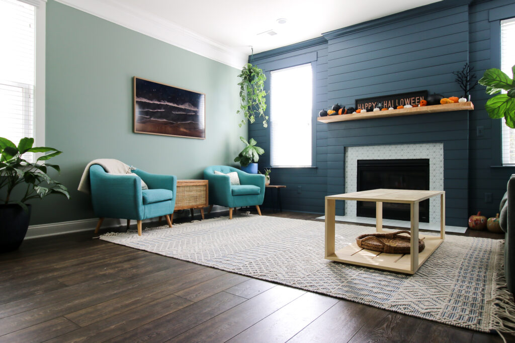
This was a massive project where we removed the old builder-grade fireplace surround and mantle and built a pop out and shiplapped the entire wall.
We painted it all "NYPD" by Behr. And by all, that includes the crown molding and the window boxes.
We also added a custom made mantel made from curly maple and added peel and stick tile stickers to the black granite fireplace surround.
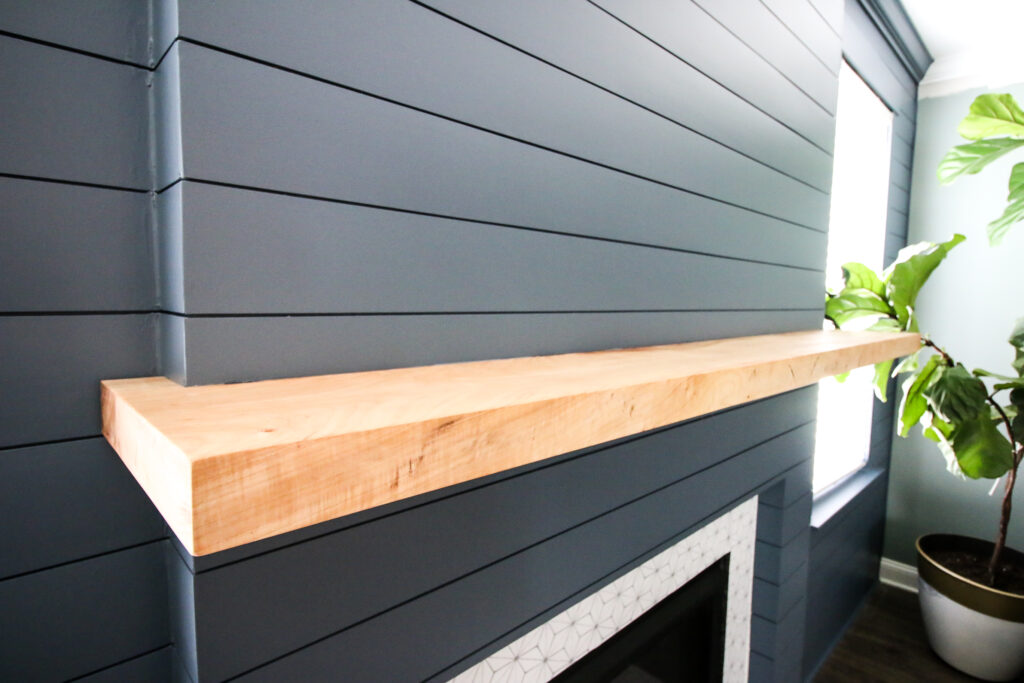
The entire wall is so much better now and is a massive focal point for the entire first floor.
After installing the accent wall, we had to sell our old IKEA entertainment center because it was a competing focal point.
Instead, we upgraded our TV to the new Samsung Frame TV and built a side table with tile top that doubles as hidden storage for our media console.
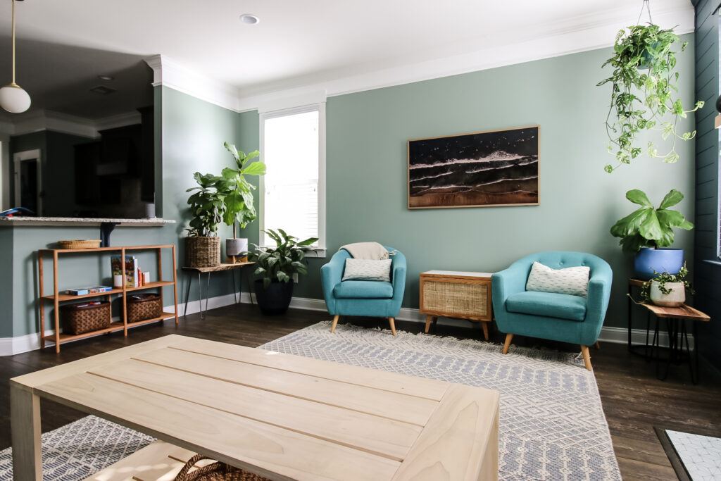
It's a really cool project that hides all of our devices and looks like a sleek modern piece of furniture.
Since we no longer had a place to store toys in that entertainment center, we also built a quick and easy dowel rod bookshelf that we store kids books and baskets with toys.
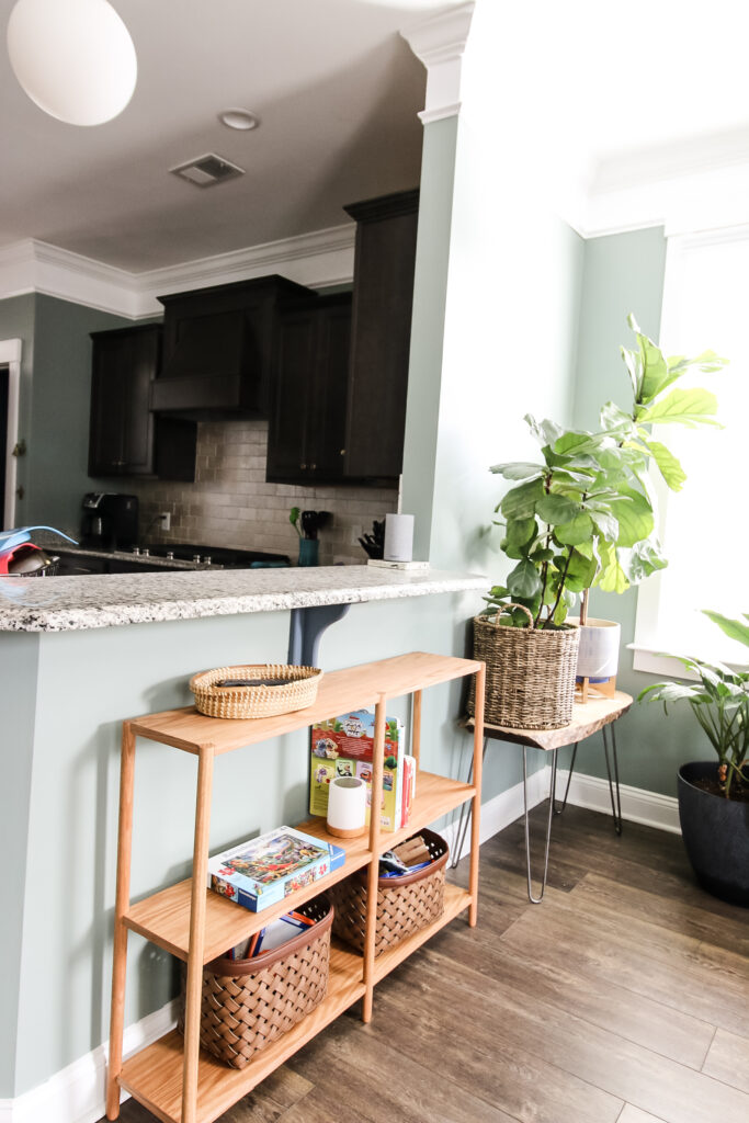
We also got a new rug that fit the space better and built a new rectangular coffee table.
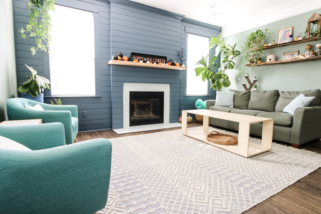
Our old round coffee table didn't work in this space because we built it for our sectional sofa in our old home.
This modern rectangular table works better with the lines of the shiplap wall.
Finally, we previously installed a new gold, modern fan and built a slim farmhouse style console table for behind the couch back when we first moved in.
These were "essential" projects that we did before coming up with our final plan.
Eat-In Dining Space Reveal
Our house has an official dining room, but we are using that as our office (hi, I'm typing from here!) because the eat-in space off the kitchen and living room is large enough to fit our geometric dining table and angled bench that we built a few years ago.
We eat all our meals in that dining area or on the screened in porch and it's plenty big for what we need.
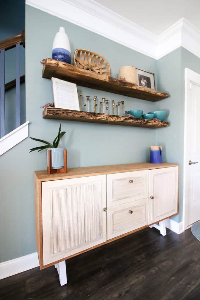
The major change here was that we needed to get rid of the old IKEA china cabinet we had on the back wall.
This was a holdover from our old home that didn't really fit this space.
So, we built a DIY buffet table with fluted doors that is a gorgeous piece of modern furniture.

To fill out the wall, we hung two massive maple slabs as floating shelves that we can use for decor.
It's a beautiful background for our dining and looks great!
Kitchen Reveal
The kitchen is the part of our gathering that got the least makeover of them all.
Our plan changed during this entire process and we decided not to paint the cabinets or do anything major during this initial makeover because we are now thinking we will gut the kitchen next year.
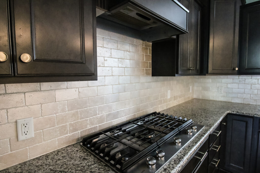
So, the main project we took on here was painting the travertine tile with a shimmery look to mimic the two light fixtures hanging in the entry and dining room.
This yellowy stone color didn't work with our vibe, but by painting it, it looks much cooler and works better with our entire space.
When we first moved in, we also swapped the rusty gross hardware with dusty gold knobs and pulls that tie to all the gold features in the rest of our space.
Inevitably we will do more projects in these space over the course of the time we live here, but this is everything that went into the original makeover.
We hope you loved seeing everything we did and can find something to use in your home as well!
Looking for something?
We've been doing this since 2012 so we have a LOT of blog posts!
Search stuff like: Ceiling Projects | DIY Plant Stands | Thrift Flips


Hello, I'm Morgan, half of the creative force behind CharlestonCrafted.com! With a passion for DIY that dates back to 2012, I've transformed three homes and now I'm dedicated to helping others craft their dream spaces. Let's turn your house into a home together!


